Go to:
Role
Impact
Overview
Context
Challenge
Research
Design
Motion
Testing
Decisions
Influence
Future
Reflection
Go directly to:
Role
Impact
Overview
Context
Challenge
Research
Design
Motion
Testing
Decisions
Influence
Future
Reflection
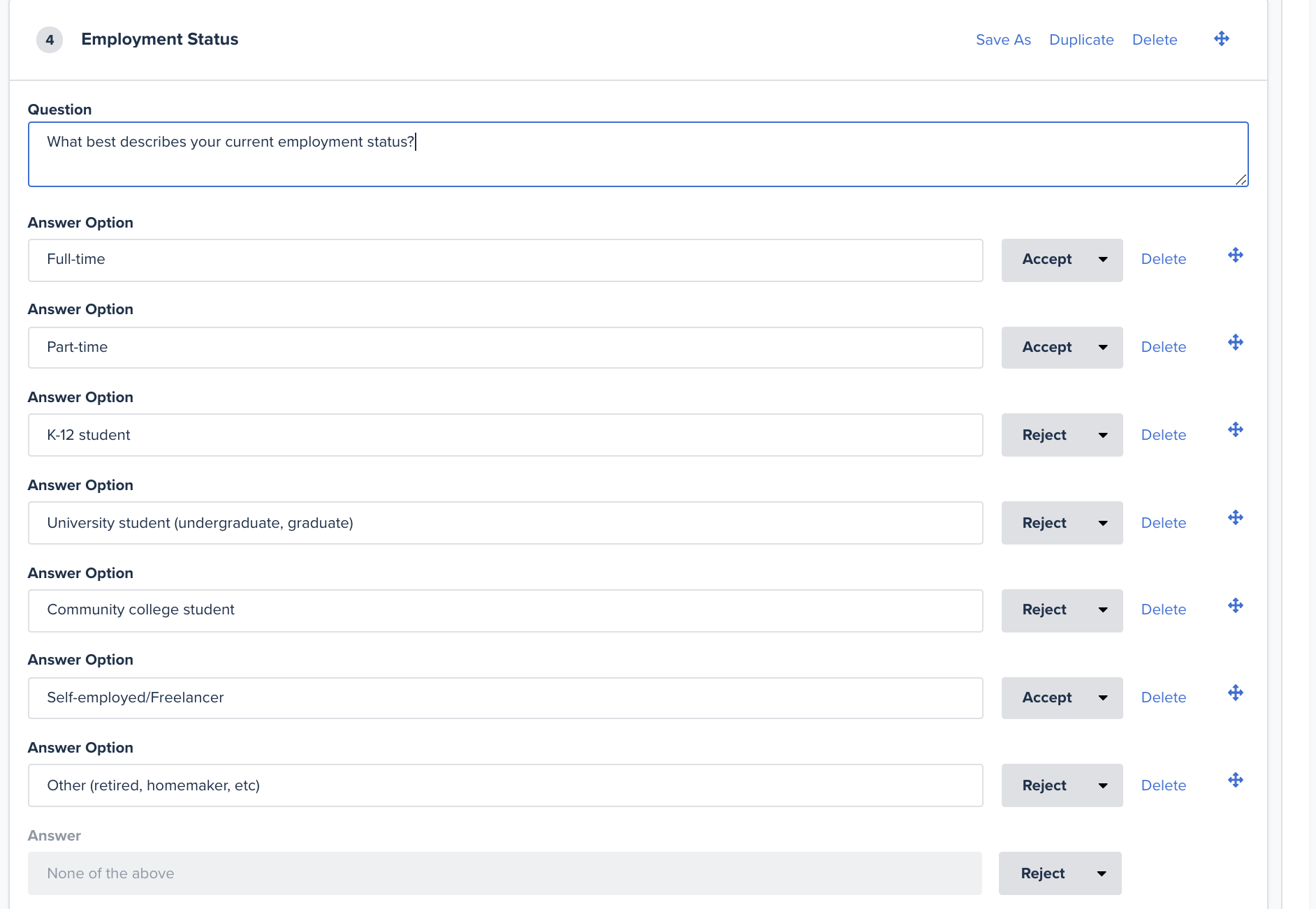
Onboarding Microsoft To Do
Showing users what they get from To Do without having to log in, through storytelling experiences.
Role
As the UX Designer, I:
- Led the end-to-end design of the onboarding experience from scratch
- Collaborated with PMs, engineers, and researchers to align on constraints and goals
- Brought motion design into the process to make the first moments with the app feel dynamic and polished
- Facilitated remote usability testing during the early days of the pandemic, adapting methods for unmoderated, distributed participants
Impact Snapshot
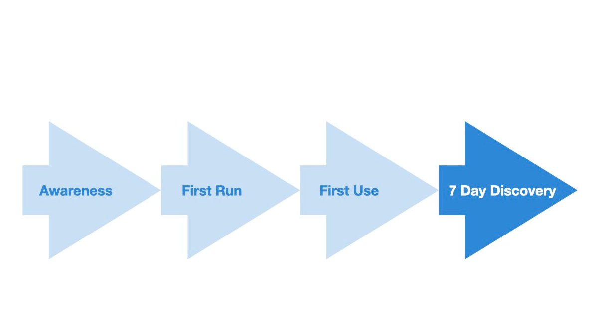
- Enabled ~66% of new users in testing to reach the “aha” moment before sign-up, maintaining conversion while unlocking new trust and engagement benefits over the existing account-first flow
- Cut time-to-value to under 2 minutes and ~5 purposeful clicks, faster and more engaging than competitor flows
- Pinpointed why the remaining 34% dropped off and produced a validated concept for exploration-before-sign-up onboarding. This was not shipped due to pandemic reorgs, but the findings informed later onboarding experiments within To Do
Highlights

Final Proposal video for user testing - Onboarding Proposal - Microsoft To Do
Project Overview
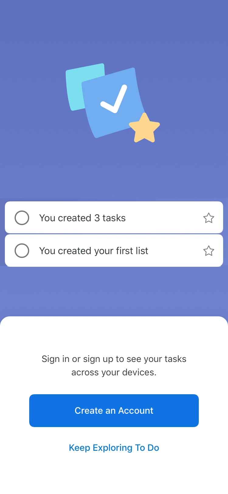
Microsoft To Do required users to sign up before they could see any part of the product. For a productivity app, this created a major trust and friction barrier. My task was to design an onboarding experience that let people explore value before committing, without breaking Microsoft’s account-first ecosystem.
![]()
Context
When Wunderlist joined Microsoft, we set out to combine its simplicity with Microsoft’s ecosystem power. In the process, we inherited a mandatory sign-up wall.
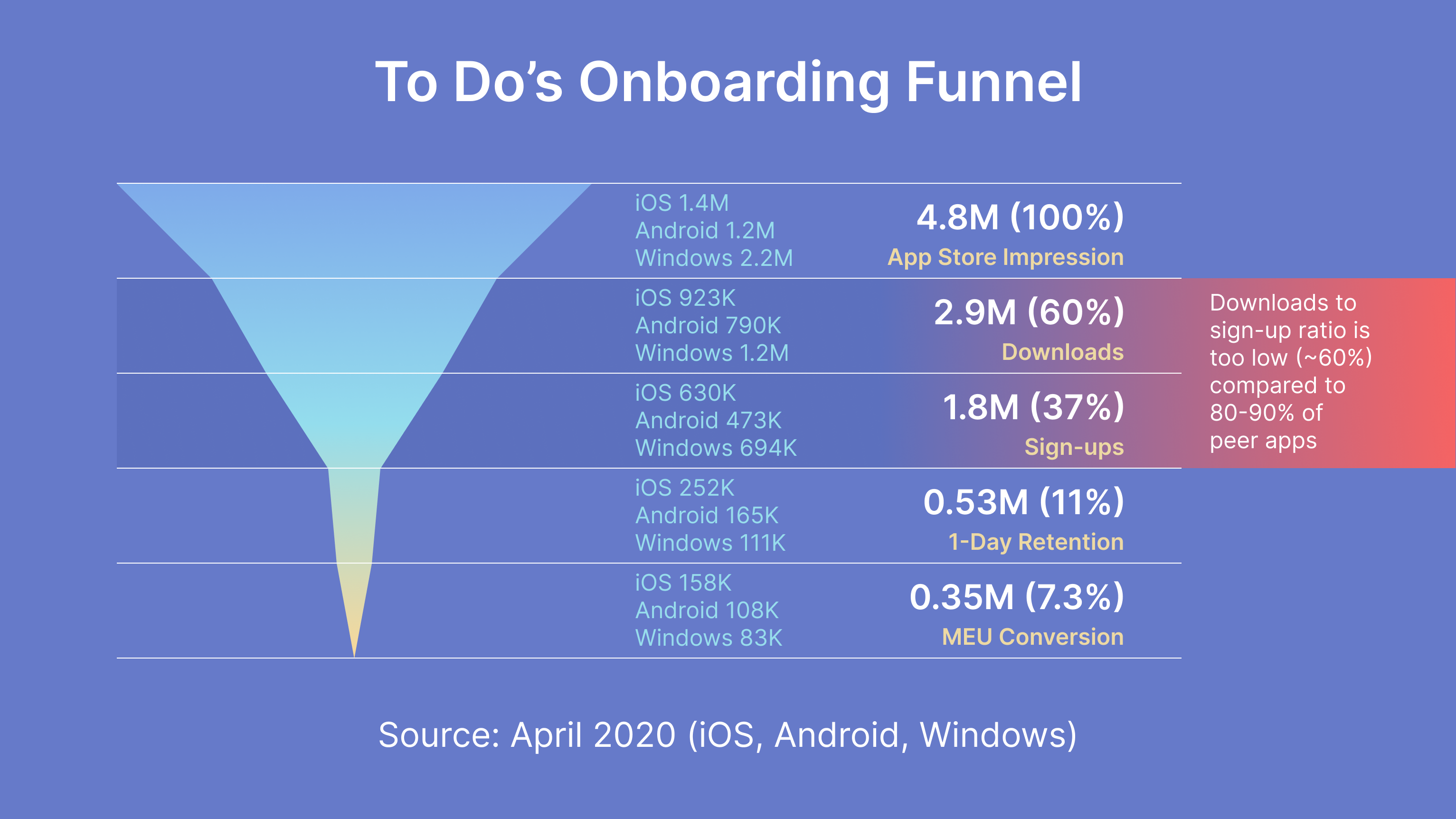
By 2020, To Do was seeing:
By 2020, To Do was seeing:
- 60% sign-up rate post-download, far below the 80 to 90% common in competitor apps
- A growing list of user complaints about being forced to create a Microsoft account to even try the app
Challenge
Business problem: The onboarding funnel was “skinny,” with too few users making it past the first screen.
User problem: Productivity tools are personal, and users were not willing to commit without knowing if To Do fit into their workflow.
“Maybe I can use the app without having an account.” User feedback
![]()
User problem: Productivity tools are personal, and users were not willing to commit without knowing if To Do fit into their workflow.
“Maybe I can use the app without having an account.” User feedback
Research
I ran a competitive scan of onboarding flows from leading productivity apps. Two consistent friction points emerged:
- Mandatory sign-up before showing value
- Extra step of creating a Microsoft or Hotmail account for new users
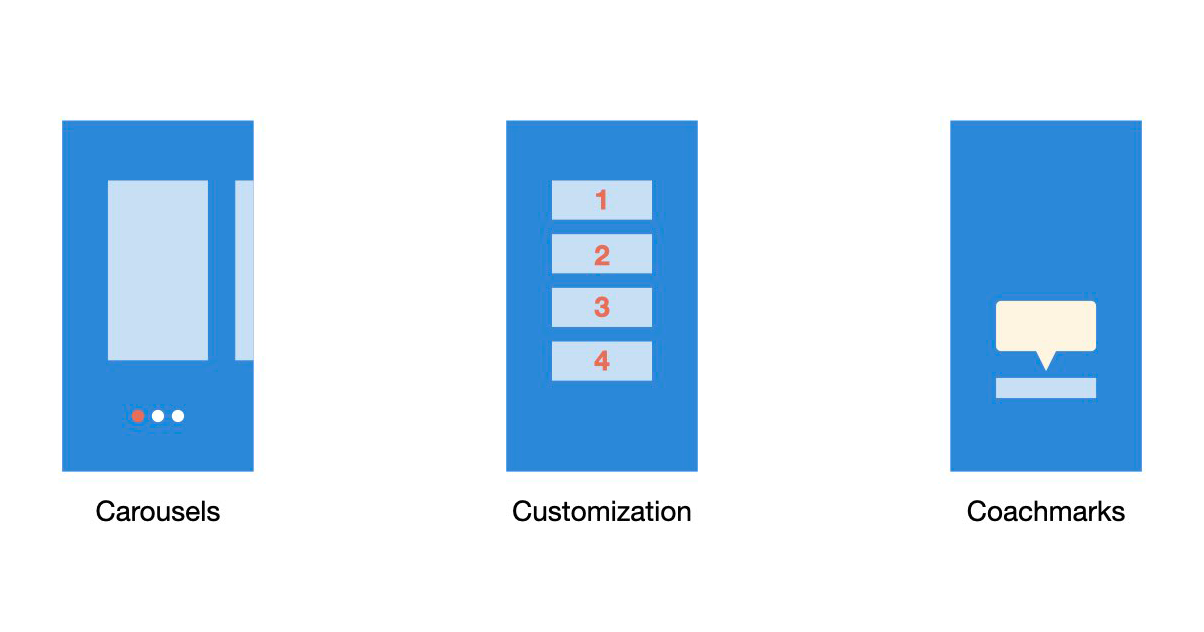
Design Directions
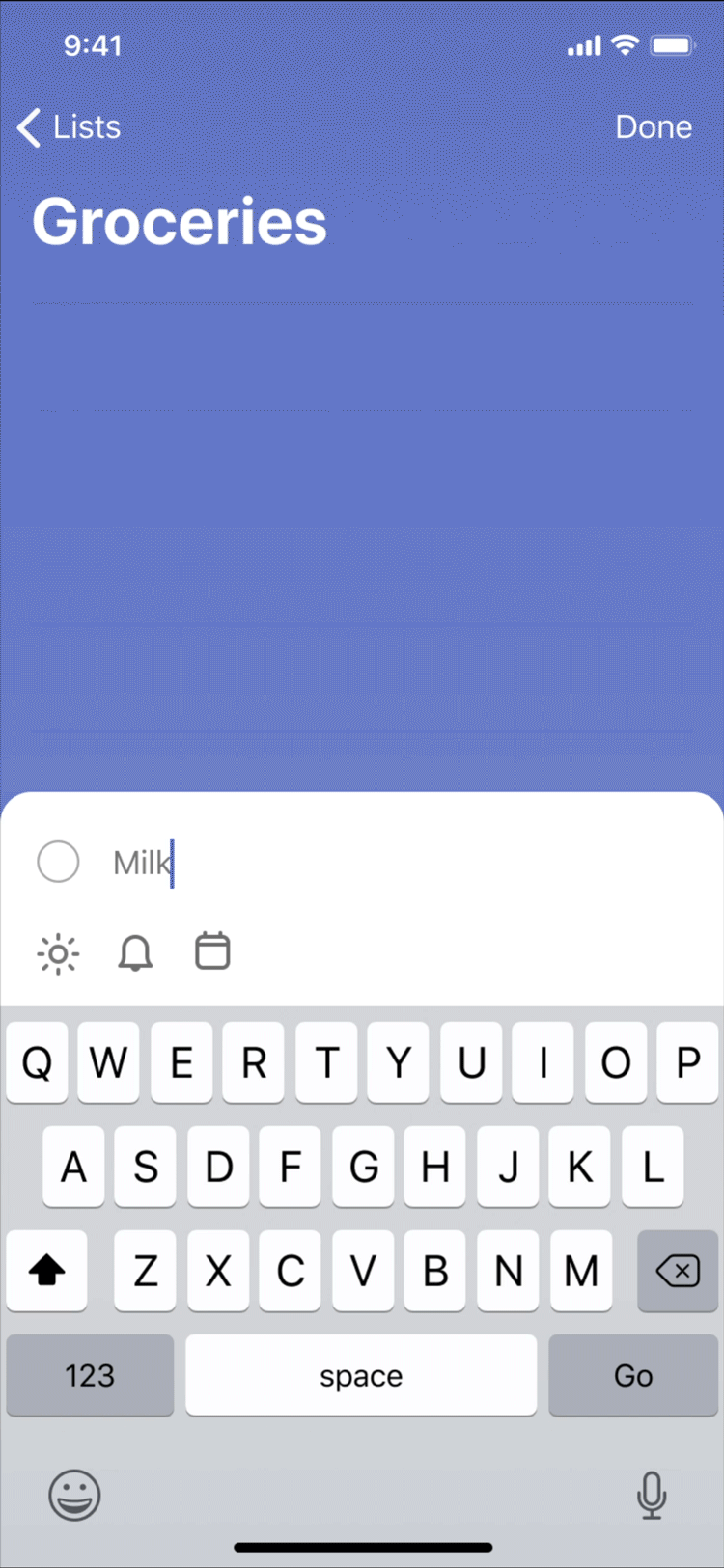
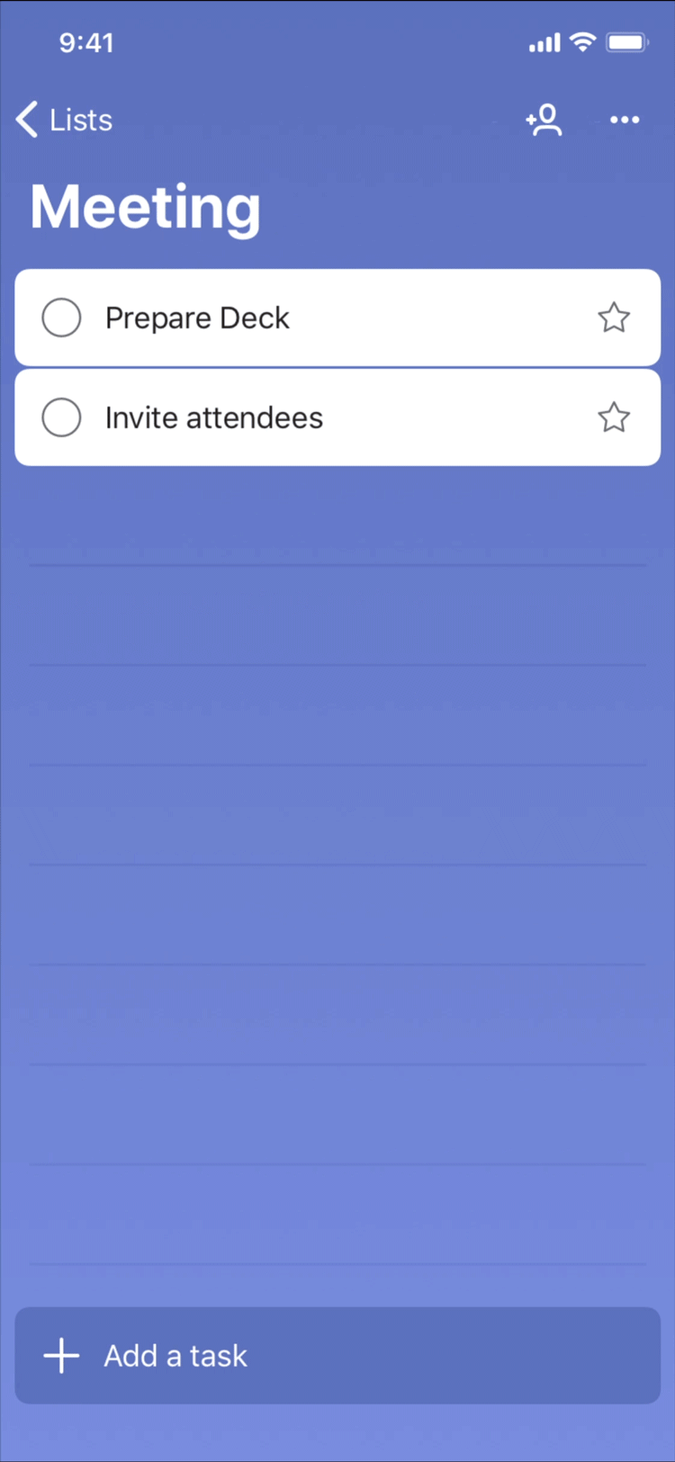
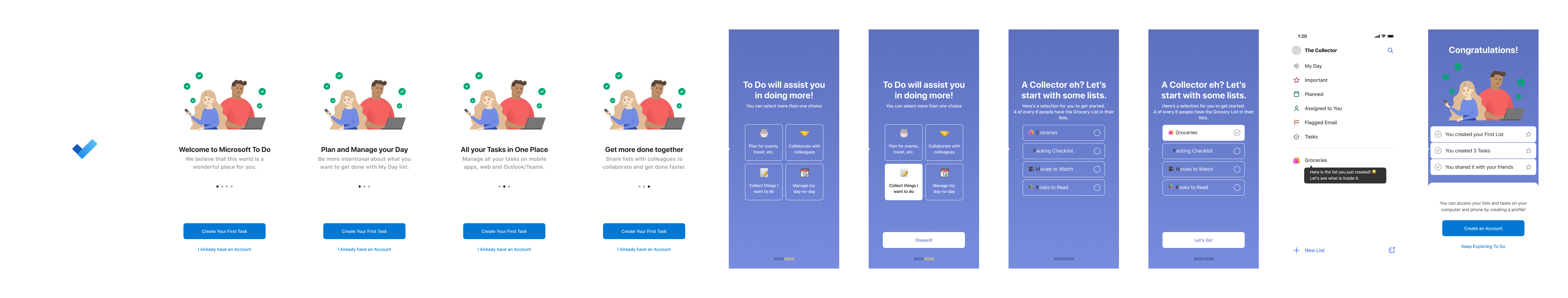
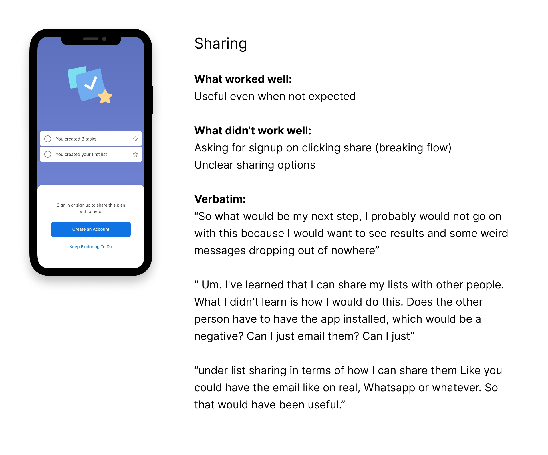
I explored four flow options, mixing carousels, coachmarks, customization, and a welcome list:
![]()
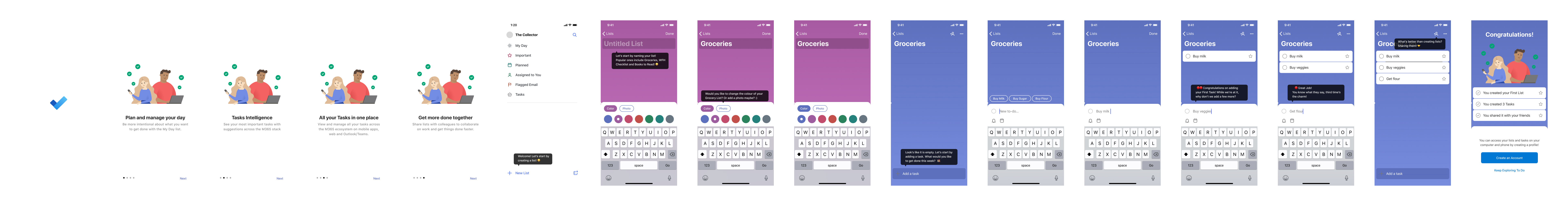
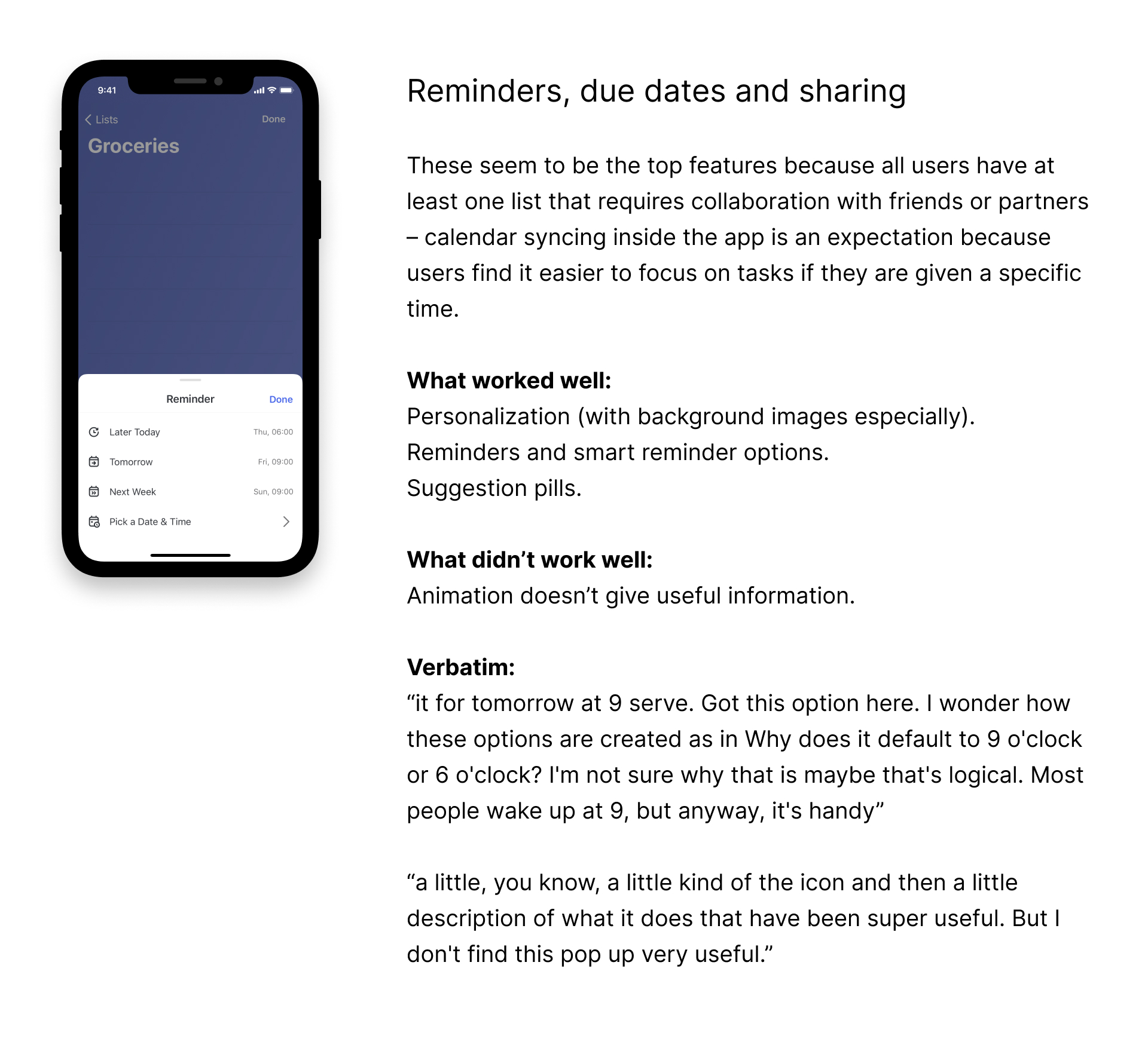
Additionally, the My Day feature is unique to Microsoft To Do. It provides a fresh, clean list every day so you can plan tasks that need immediate attention. This direction showed value by introducing users directly to My Day.
![]()
- Carousel and coachmarks
- Customization and coachmarks
- Carousel, customization, and coachmarks
- Welcome list and coachmarks
Additionally, the My Day feature is unique to Microsoft To Do. It provides a fresh, clean list every day so you can plan tasks that need immediate attention. This direction showed value by introducing users directly to My Day.
Flow 1 - Carousel, coachmarks
Flow 2 - Customization, coachmarks
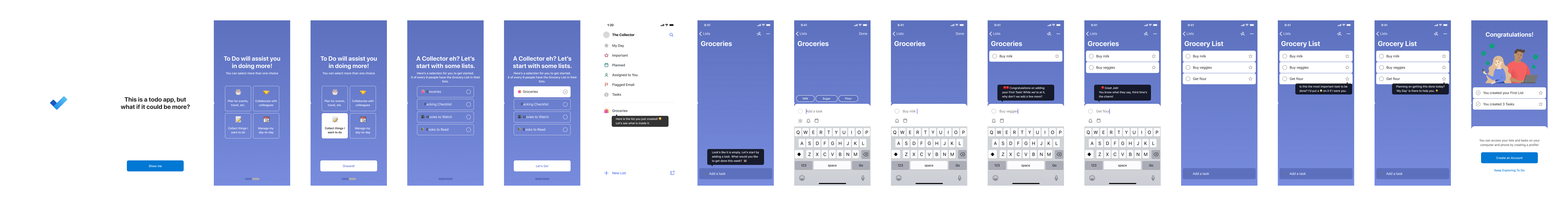
Flow 3 - Carousel, customization, coachmarks
Flow 4 - Welcome list, coachmarks
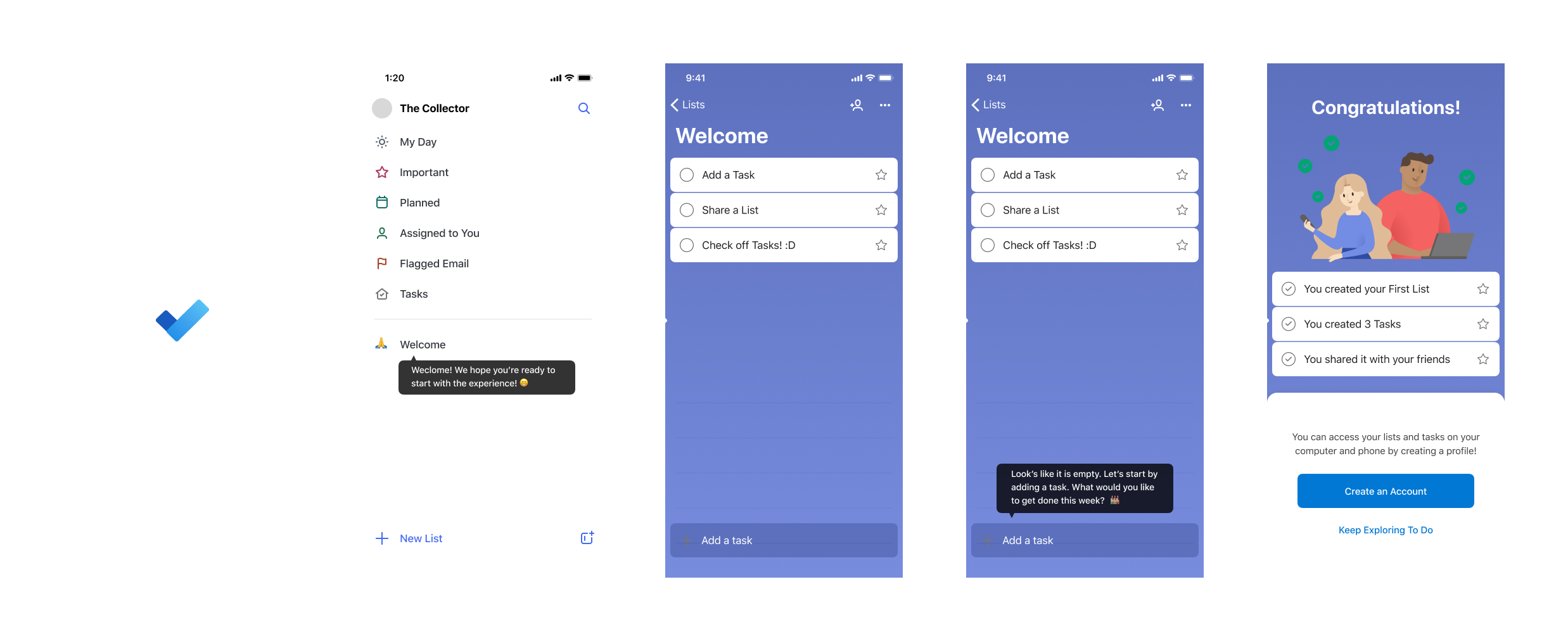
Motion
Motion design was a key part of my process. Onboarding is one of the areas where motion can help or hurt. I started with the coachmark areas and developed ideas to make them more dynamic.
Motion Prototypes
The next step was bringing the motion directions into the flows and get them ready for testing.
Final Proposal for User Testing
Testing
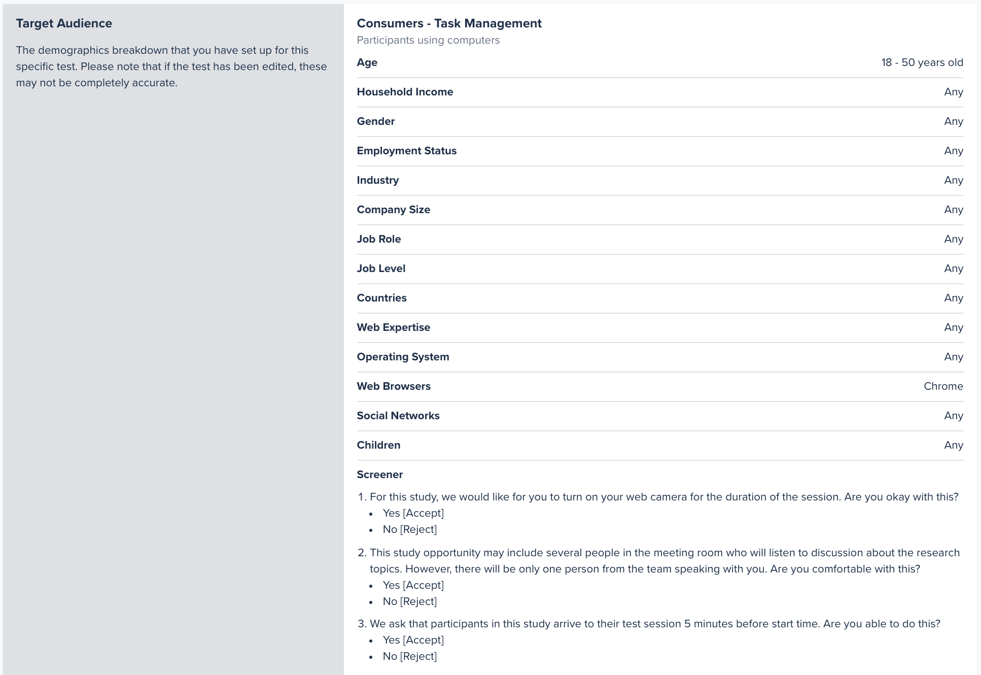
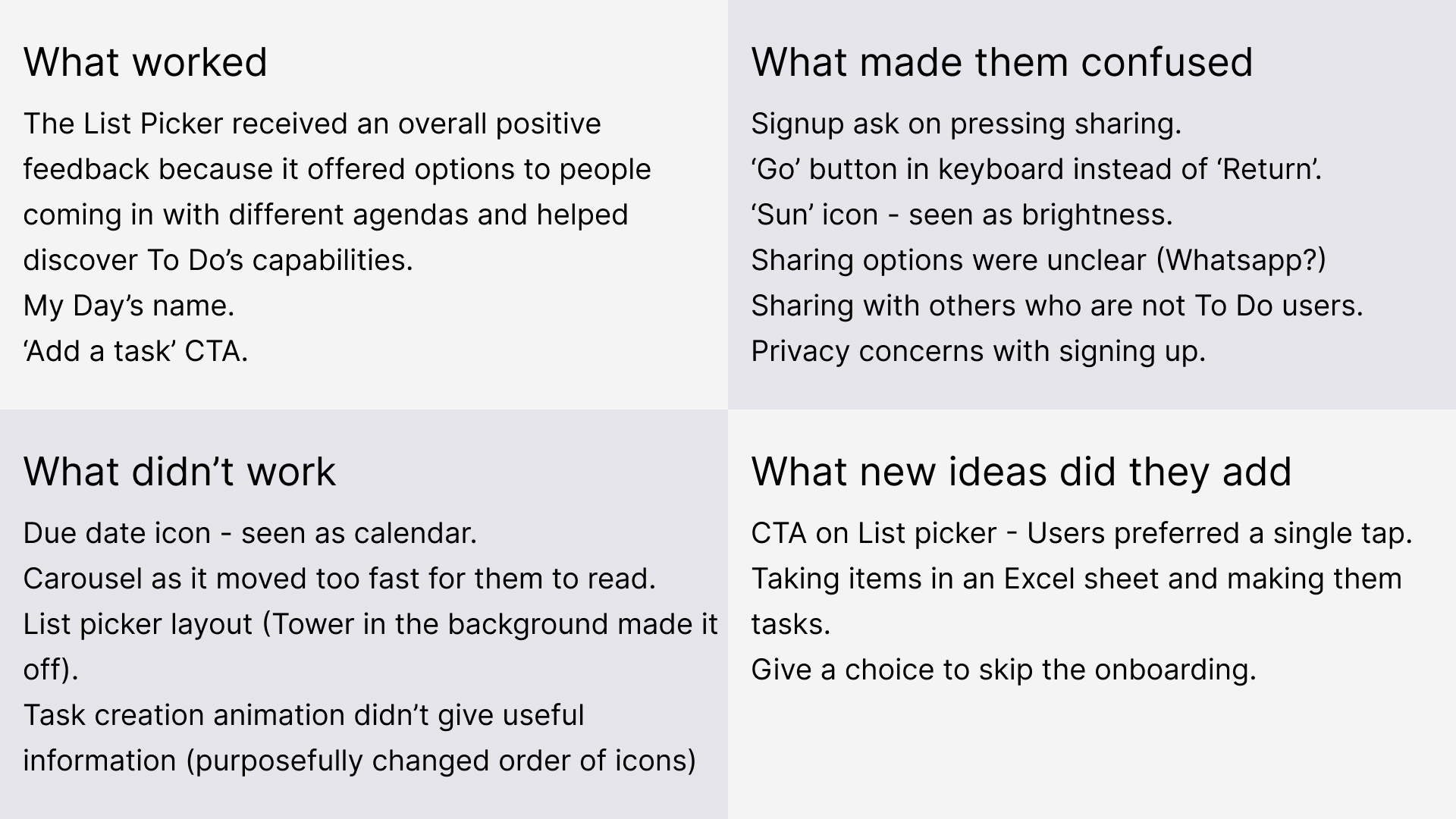
We tested the prototype remotely with 8 participants on usertesting.com, and asked them to think aloud as they explored the flow.
Prototype success rate: about 66% reached “aha” without dropping out.
Top drop-off causes:
Prototype success rate: about 66% reached “aha” without dropping out.
Top drop-off causes:
- Copy clarity issues, with icons and text misunderstood
- Optional step confusion, where skip behavior led to missed required interactions
- Testing artifacts, including distractions in unmoderated sessions
- Minor UI friction, such as unclear tap targets and pacing


Insights
My background as a Data Analyst helped me sift through the noise and find insights that helped improve the next iteration of the flow.


Important Insights
Relevant to our Exercise
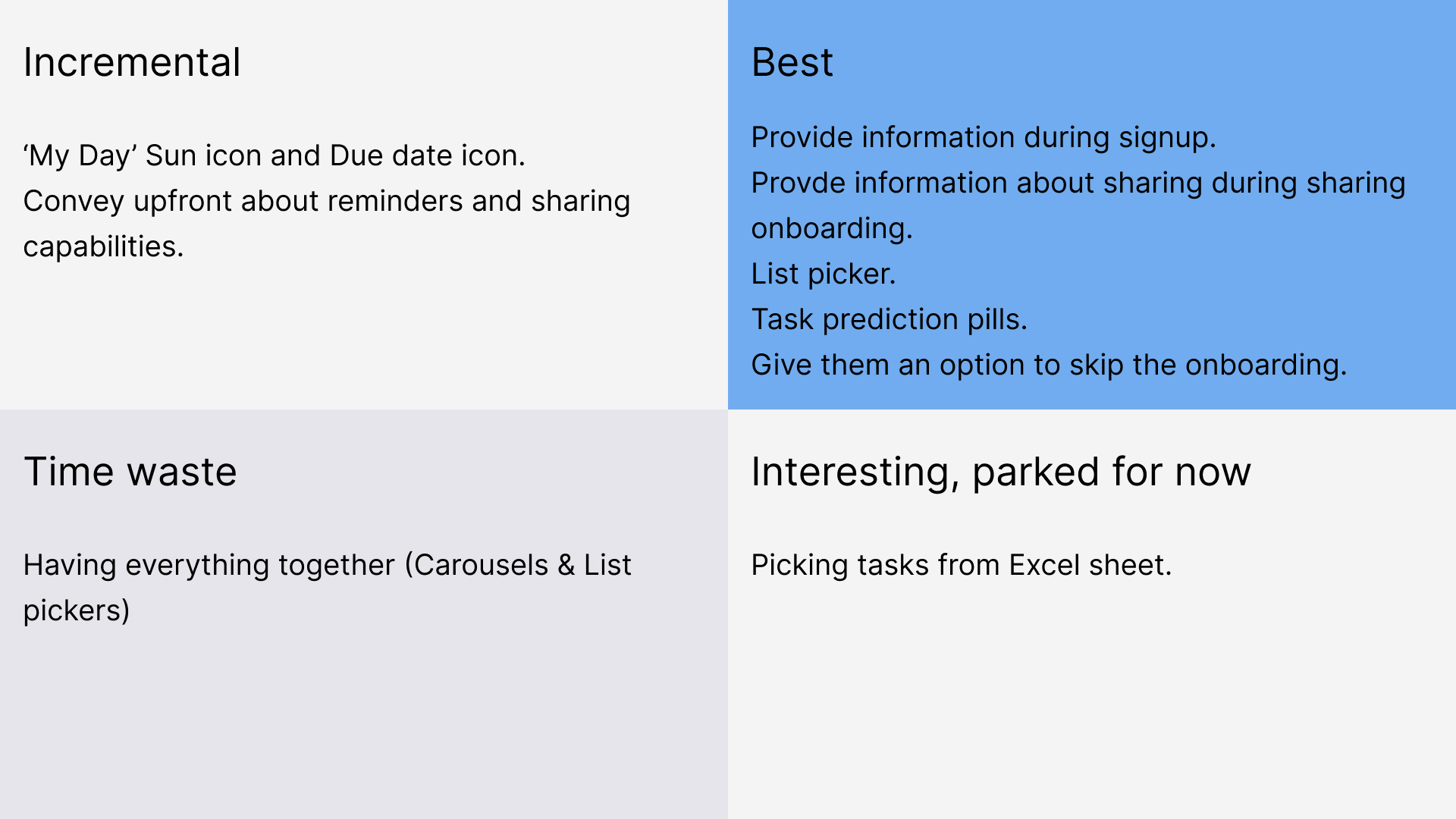
Key Decisions and Trade-offs
- Chose Flow 3 for a balance of speed and personalization
- Reduced certain customization prompts to decrease friction
- Recommended a modular onboarding that could adapt by platform
My Influence
- Advocated for exploration before sign-up as a viable business path
- Introduced motion design to onboarding for the first time in To Do
- Aligned product, design, and engineering on a testable MVP
Future Impact
The flow was paused due to COVID-19 reorgs and shifting priorities. The research and design artifacts later informed onboarding experiments within Microsoft To Do.
Reflection
This project taught me to:
- Build an onboarding system from scratch within an account-first ecosystem
- Adapt quickly to remote testing and collaboration
- Use motion as a functional onboarding tool, not just an aesthetic layer
- Turn small-sample usability insights into clear design changes